Design workflow for developers
2021-7-23As developers, resolving design problems via code is often our job but wouldn't it be cool if we could design in a way it aids our development process?
As a developer, when I first got started with UI/UX, I often wondered what was the best way to connect my designs with the code. Let me tell you this - there is no such thing( I figured that out the hard way struggling to be a perfectionist).
Every designer/developer has their way of doing things, their workflow, and tricks that make their lives easier as a developer and/or designer. So in this post, I will share some of mine. I am not going to talk about design or development in particular, rather how you connect those two. Things like how do you design and export your work in a way that it helps in the development.
This is more of a workflow(diverted towards developers) showing post so, I will assume you already have some design and development knowledge. Even if you don’t, thats alright, there isn’t anything super technical here, and I’m sure you will find something useful. Finally, I am a web designer/developer so, this post will be based around web development but the core concepts may be applied to any other type of dev.
Design Assets
I recently created my portfolio website, which you can check out here. I will take my design for that as an example. Also, I will be working with Adobe XD here but the same principles apply to pretty much any other UI/UX design tool.
Without diving into much detail, I want to clarify some things. It is almost always a good idea to sketch out a basic layout of your application with pen and paper. Create wireframes(version with just the structure of application) if you have to, and finally get started with the high fidelity version( one with the right fonts and colors ).
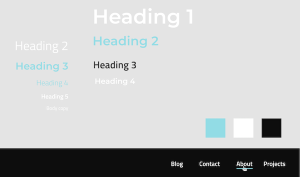
Once you have decided on the fonts and colors, be very clear about things like font sizes and weights from the get-go. I like to decide everything early hand, put them in the design assets, and work on everything only from those assets. By doing that, if I want to change any particular font or color, I just have to change them in my assets, and everything in my design relating to those also changes. In development terms, it’s much like creating variables.
First, I like to define and keep them on the top of my main artboard. From there I add them to my assets. If you can’t decide everything from the get-go, don’t stress over it. Down the road, when you decide to use a particular combination, add it to this list first, then add it to your assets, only then use it in your design. It's some extra work but believe me, it will save you a lot of time and effort later.
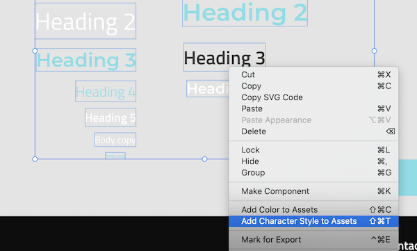
In XD, adding to assets is quite easy, just select them, right-click and add them to assets.
You can do the same with your color palette.
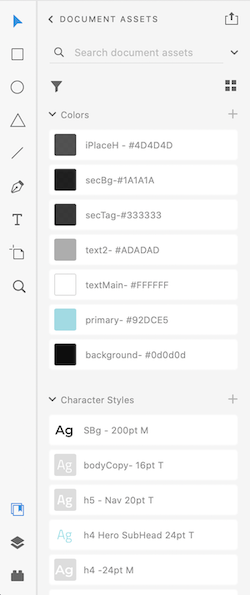
Once added, you can view these assets in the bottom left corner, under Libraries -> Document Assets. Here, you can rename or modify your assets. About renaming, be very creative and descriptive. For colors, I like to do, ‘Usage - Hex code’. For character styles, ‘Usage - font size - font family’. This especially helps me getting started in the development process. Usage for font or color can be more than one, but you want to be subtle here, and add only the most relevant usages in the names.
Design
Now, a bit about grids. Every UI/UX design tool allows you to work with grids and on the development side with the availability of CSS grid, it's a great time to be working with grid layouts. In XD you can use an overall grid for your design and align-items according to that grid. You might or might not want to base your design grid on how you want to implement your overall layout in code. What I mean by this is, say you want to use CSS grids for your overall layout and your layout elements are fairly simple, in that case, it might make sense to align the design grid with the development grid. But in most cases, the overall layout in development is not enough and you might have nested elements that have their complex layout with either flexbox or CSS grid. In those cases, what I have found most effective is, you do your own thing with the layout in design, align things up properly with or without grid and bring with you all the design specs, spacing, and alignment( will talk about this later) into development, and implement those specs with the technologies and options you have at hand. Of course, this also depends on the job at hand and personal/team preferences.
For the design process, there are multiple approaches you can take. Whether it be design or development, if I have a choice I like to go with the desktop-first approach( no particular reason, just a personal preference). For my portfolio website, I decided to only design the desktop version and worry about smaller screen sizes during development. I could do that as it was a personal project with only me involved, I had a clear picture of how I wanted the different pages to look on smaller screens, and this approach seemed quite time-efficient in my case.
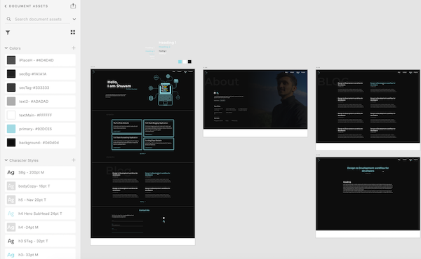
But again this depends on your project. Like in a recent freelance project, I had to get approval for the design from the client before starting the development. Here, once again I started with the desktop version and once that was done, I worked on the tablet and mobile versions by creating different artboards for each and deriving the design for tablet and mobile, based on the desktop version that I created.
After the basic design is done, you can do things like prototyping and even animations, but all that is a little bit out of the scope of this post, and I will not talk about them here.
Like I said before, I am also not going to talk about the entire design process. So at this point, I assume you have made your decisions, designed your application, are happy with it, and are ready to start the development or pass on your work to your team.
Exporting
Most of the things in our design like background, gradients, buttons will be done by code, but there will also almost always be items like images and SVGs that are to be passed on for development. The developers will also need design specs like spacing and alignment. There are multiple ways of doing this in XD. You can individually export necessary items and export artboards as jpegs or PDFs. This is alright if it serves your purpose but XD has another elegant way to solve this for you.
If you are a designer, you might already know this next bit, but for me, when I found out about it, it blew my mind and has made my work tons easier since. It’s called ‘publishing design specs’. Once your design is done, decide on all the things that the developer will require and mark them as exports( don’t worry if you don’t get them all, you can update this later). Marking for export is again very simple.
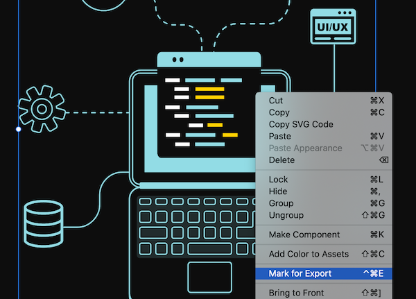
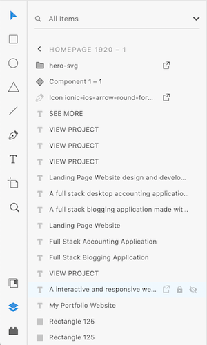
To view these marked items, from the bottom left corner, go to the Layers panel. Here you can view all your items on a particular artboard, and the items marked for export will have an arrow sign beside them. You can also mark for export by hovering over an element in this list and clicking the arrow sign.
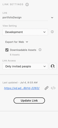
On the top left corner, you will find a Share option, which will allow you to create a link that you can share with other people. In the link settings, select the Development/Design Spec, check the downloadable asset option, and create your link. XD keeps changing things up so, if you are reading this way in the future, things might look quite different, but you can make all of this work for your XD version with a bit of looking around or the documentation on Adobe can also help you.
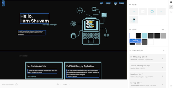
Now comes the fun part, copy the link and paste the URL into your browser. If you didn’t make your link public, you’ll have to log in with your Adobe account to get access.
All the colors and character styles that you defined are there, all the elements marked for export are available for download, all the design specs like spacing and alignment are there(click on an element and hover over other), and much more. You can even view the CSS code for particular elements like buttons and gradients. Explore it all for a while. See what you have and what you need from the design part, make those changes in your design, and update your link to see them reflected in the design spec.
There are a lot more features like comments and reviews. If you are working with a team or with a client, these features can be quite useful. If you design and haven’t tried this feature in XD, I highly recommend that you at least give it a shot.
Conclusion
With this, it brings me to the conclusion of this post. We looked at starting a design project, designing with development in mind, and exporting in a way it aids our development process.
I would like to mention that the things I shared here are quite opinionated, and they come from a developer’s perspective who is learning to design. I suggest that you take some tips from here and try to build upon that, creating a workflow that serves you or your project best.
Also, like most of us here, I too am a constant learner so, if you think I am missing out on something or can do something better, feel free to correct me or add to the tips I have shared.
Thank you and happy designing!